Subscription platform re-design build users and stakeholder confidence
About SPH (Singapore Press Holdings)
After joining SPH (Singapore Press Holdings) in January 2020, this was one of my first initiatives to lead. SPH is a consortium of companies that publishes over six newspapers and more than 10 magazines, and consumers can subscribe via a variety of methods (Social networking, Publication Paywall, eShop, and other sources). To redesign the SPH Subscription platform (eShop), I worked closely with my commerce design squad team.
Highlights
As a design manager, I mentored and led the Subscription Squad team to increase the product's efficiency and effectiveness for the company's growth and customer satisfaction.
1 User Researcher, 1 UX Intern, 1 Product Designer, and 1 Creative Technologist comprised the Subscription Squad.
In addition, I was accountable for stakeholder alignment and design advocacy.
The problem
We were making decent subscriptions through numerous touch points such as customer service agents, offline marketing, vending machines, 7-Elevens, corporate contracts, third-party vendors, airports, and others, but our total sales performance suffered as a result of the pandemic (COVID-19).
People wanted to know what was happening in the country and other essential information to keep them safe and informed. This has raised the demand for news consumption and subscriptions, as well as the traffic to our subscription platform (eShop) but not conversions.
We were also aware that our digital touchpoints had usability and technological issues, that the pandemic had halted the majority of offline sales, and that our users were having trouble subscribing to our magazines through this platform. Consequently, we need a well-designed solution to solve immediate customer pain points and unclog the sales funnel.
Discovery
We involved our User Researcher to conduct user interviews and heuristic evaluations to identify design challenges. Some of them were:
Difficulty browsing as it was overwhelming with a lot of extraneous information.
Too many form fields for each step of the checkout process and ambiguity about how much time it would take for a sale.
Perception of a non-sph website or brand due to different branding from our publications.
Some of the older designs are shown below for reference:
Introducing Design Principles
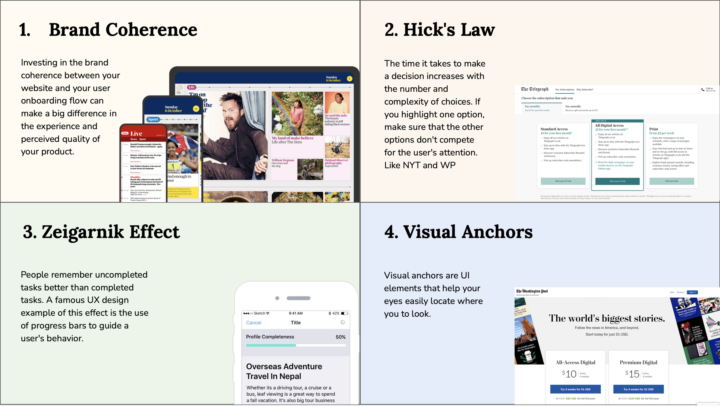
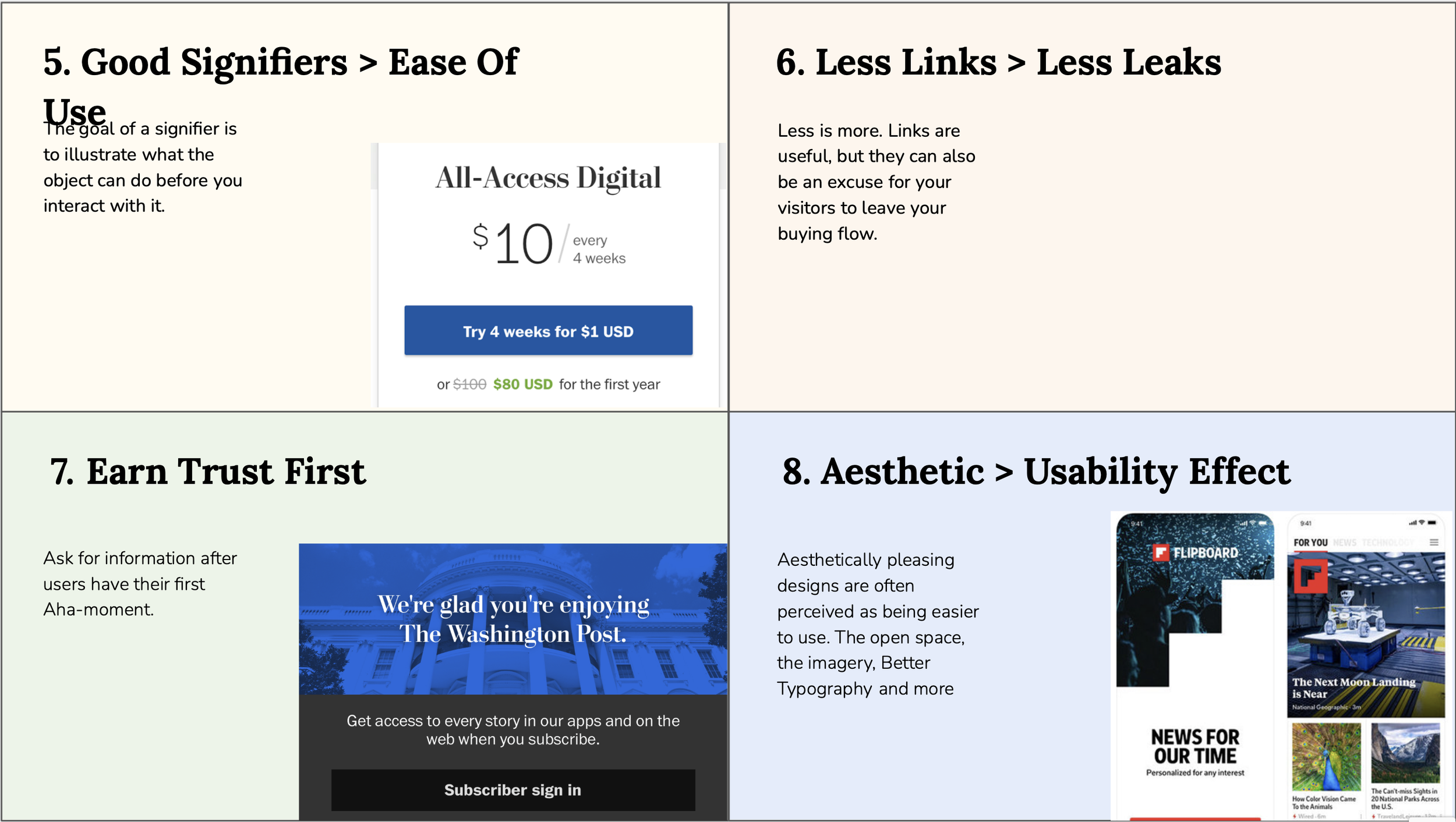
As a first step in the design process (before creating any wireframes or designs), we introduced Design Principles to better focus on the design approach and inform our stakeholders about our product and design vision. We demonstrated our leading design ideas and provided examples of how other, comparable publication brands have incorporated them. We won over stakeholders thanks to this method, and they eventually began to see a design for what it really is, rather than just a set of pretty colors and pixels.
Getting hands dirty!
After gaining the confidence of stakeholders, we engaged them in workshops and brainstorming sessions to explore and refine concepts for various user journeys, including onboarding, purchase, and checkout flows. My team worked on wireframes and received immediate buy-in on the structure and flow, which made it simple for everyone, especially the technical members, to determine if we had bottlenecks.
It was difficult for users to navigate and overwhelming to discover the correct plan, information, and publication, therefore we wanted to address these issues in our redesign. After user testing of the main page, a number of quick wins were discovered.
Users were able to determine how many publications we have.
They can also easily discern the differences between each publication due to the summary that appears while hovering.
Subscription landing page
A significant amount of our traffic goes to eShop's landing page through a publication's call to action, and our previous design's use of blue confuses users. To instill confidenc, we prioritized Brand consistency and contextualised touch points. Ex. when users land from Zaobao (our Chinese daily). The landing page would be in Mandarin and employ brand colours such as red so as not to interrupt the user's flow.
Checkout flow
Our earlier flow was quite lengthy and the platform missed basic things like in-line form errors, asked for uneccesary things such as Address for a digital package, and did not differentiate between existing and new customers (thus requiring them to fill the same info again rather than saving card information for later usage).
Capturing only necessary fields on a single page pre-checkout with enhanced UX on error checking and validation for the smooth and effective checkout process
Express checkout for existing customers as their information is pre-populated ( i.e address and personal details)
We added an address book for the users to select their existing addresses with us.
One-click payment for existing customers as they can pay with an existing card or existing GIRO account
Outcome
With this re-design we achieved a design which was easy for users to understand so they can make their purchase decision quickly. This resulted in overall conversion improving by 9%, and Cart abandonment rate improving by 33%.


