Designing the job application process more meaningful and easy through “Conversational design”
Context
We all know that applying for a dream job requires a lot of time, patience, and better crafted application. A tiny error might keep you away from your dream job, while companies squander time and money finding suitable individuals and culture-fits. I joined Shortlist to fix this.
About Shortlist?
Shortlist aims to build a better way to hire, combining the best of tech, data, and human touch to provide executive search and talent technology services across India, Kenya, and now 20+ countries globally.
Some Insights discovered…
Imagine having to submit your resume, fill out a single or several forms, and then wait for a response before someone contacts you. It takes forever. After doing comparative research on a few job sites, we determined that there are a lot of pain points for customers and businesses.
Given the busy schedules of our target users (Corporate executives), searching and applying for a job is a time-consuming process, as they do not have sufficient time each day to fill out lengthy forms. On the other hand, it looks that applying from a mobile device is a nightmare.
Shortlisting candidates from thousands of resumes is tough for the hiring manager and sometimes it’s easy to miss out on the right candidate.
Most companies and candidates feel that they were not best matched with the role, culture, skills, and KPIs (business or technical). Hence a need to identify the right candidate for the right role becomes very important even for the first round.
Due to a large number of applicants and positions, it is difficult for employers to provide feedback and update candidates on the status of their applications. A lack of communication disengages prospects.
The idea!
After a few rounds of brainstorming with stakeholders, we decided on a conversational interface design that will assist users in completing the whole job application process with minimal effort. The exciting aspect is that you can now apply from anywhere — on your commute, during a quick break, or before bed. Some principles we considered when settling on the concept:
Giving freedom to users - Users are no longer intimidated by the sight of lengthy forms and data items. Our users spend around 40 minutes traveling to work; how can we develop a solution that they can use anywhere?
Having a mobile-first strategy will allow people to apply for employment partially and complete the rest when they have time (on mobile).Engaging and interactive - Finding and Applying for jobs is stressful and how can we make our users comfortable and provide a safe space to share details about them.
Designs…
1. Simplify and minimalist design approach: One step at a time
I tried to keep the UI as minimalistic as possible so users don’t get overwhelmed and they can focus on completing the task.
2. Personalized and friendly: Using a natural “chat-based” method!
Users are accustomed to utilizing messaging applications such as WhatsApp and Telegram. We intended to provide consumers with an environment in which they feel as comfortable, protected, and safe as when they are with their friends and family.
3. Futuristic design: beyond just applying for jobs…
According to our research, finding the right culture fit, skill fit, and position compatibility is also vital, thus we introduced and implemented multiple assessments.
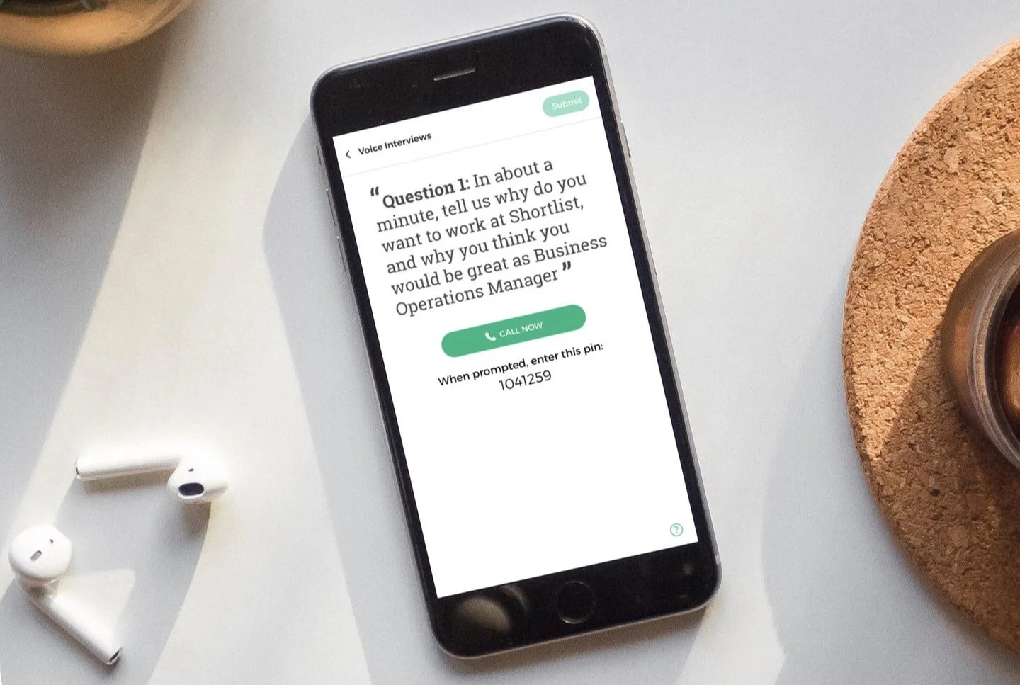
Voice interview - For basic soft skills check
Personality profiler - for Vibe check
Case exercises - Situational questions which helps us to identify Users skills.
Highlights
The product was successfully launched and tested with a small group of users before being published to the general public.
Drove design-led decisions with stakeholders to solve user and business pain points
Designed end-to-end mobile and web experiences from Discovery to Design and launch
Creation of a design system for future scalability
Some more designs
Teaser of Design system
Early wireframes for website


